Casino fonts and colours: a casino brand that is not another neon
What fonts and colours work for a casino brand? Two typefaces with separate jobs, a characterful display face and a legible UI face with clear digits, and a small palette where each colour has one role: dark base, light text, one action accent. iDesy keeps neon and gold as accents, not the whole identity.
Key takeaways
- Most casino brands share the same near-black, purple, pink and gold look, so players do not remember which site they used.
- Use two typefaces with separate jobs: a display face for the brand and promos, a plain UI face for menus, forms and numbers.
- A good UI font for a casino has clear, tabular digits, enough weights, every alphabet your markets need and a licence for web and apps.
- Give every colour one role: base, text, action or status, and keep exactly one accent for action.
- Check contrast on the dark base before approving the palette; a perfect button colour may need large labels or a darker shade.
- Test the logo and accent on white and in one colour, because the brand also lives on ads, stands and merchandise.
What fonts and colours work for a casino brand: the short answer
A casino brand needs two typefaces with different jobs, a character face for headlines and promos and a plain, highly legible face for the interface and numbers, plus a small palette where every colour has one role: a dark base, a light text colour, and one accent that means “act here”. Neon and gold can stay, but as an accent, not as the whole identity.
At iDesy we design casino and betting brands together with their platforms, so every font and colour choice is tested on real screens: the lobby, the cashier, the jackpot counter, the bet slip. Below is how we approach it, with examples from Bitspinz, Sirwin and Woombet.
Why another neon casino does not stand out
Open ten casino lobbies and most of them share a look: a near-black background, purple and pink glow, gold coins, a bold condensed headline. Each one looked exciting on its own. Side by side they blur into one, and a player who comes back next week does not remember which site they used.
Memorable casino identities usually break exactly this habit. They pick one recognisable idea, a style of illustration, a historical period, a single strong colour, and carry it through. That is the approach we take: the dark base stays, because players spend long sessions in the lobby and a dark interface makes game art pop, but the brand gets its own accent and its own type.
Two typefaces, two jobs
The most common font mistake in casino design is asking one typeface to do everything. A display face with character looks great on a banner and falls apart in a transaction table. A neutral UI face reads well at 12px and makes the promos look like a bank.
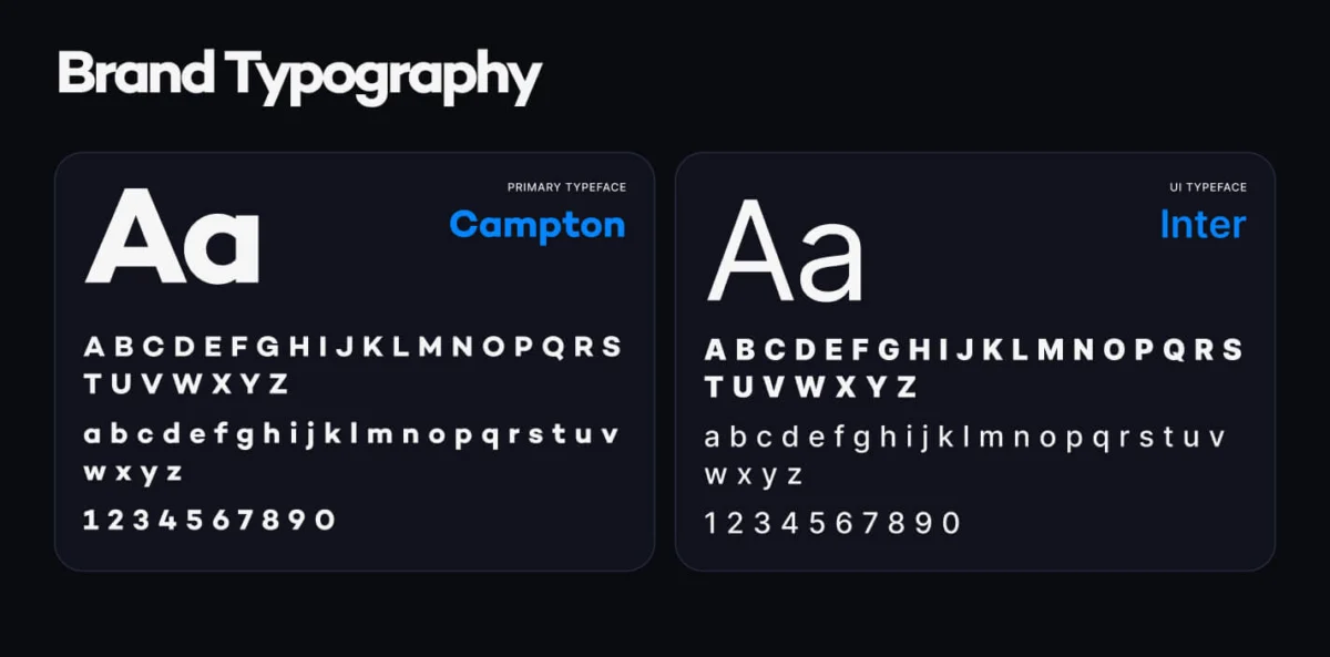
For Bitspinz we split the roles. Campton is the primary typeface: geometric, heavy in bold weights, used for headlines such as “Reload Bonus” and for promo banners. Inter is the UI typeface: menus, buttons, balances, forms and tables. The pair shares a clean, modern feel, so the switch between a banner and the cashier does not feel like two different products.
A brand can go further with a third, decorative layer. Bitspinz uses a graffiti-style lettering for words like “Welcome Bonus” and “VIP” inside illustrations. That lettering is part of the artwork, not a font the interface has to render.
What is a good casino font?
“Good” depends on the job. For the interface face, the one that carries balances, odds and forms, we check these points before any visual work:
- Clear digits. 1, 7 and 4, 0 and O, 3 and 8 must be impossible to confuse at small sizes. Balances, bets and wagering progress are numbers first.
- Tabular figures. Digits of equal width keep columns of amounts and odds aligned, and stop a jackpot counter from jumping as it ticks.
- Enough weights. At least regular, medium and bold, so hierarchy comes from the type and not from more colours.
- Every market’s alphabet. If the platform will launch in Ukrainian, Portuguese or Turkish, the font needs those characters with the same design. We have this rule on our own site: the script typeface on our contact block has no Cyrillic, so that label stays in English on the Ukrainian and Russian pages.
- A licence for web and apps. Some display fonts are licensed for print only, or per page view. Check before the brand is built on it.
For the display face the bar is different: it has to be recognisable in a banner, in an app icon and on a 300px ad creative. Free fonts are fine for this if the licence fits; what matters is that one is chosen and used consistently.
Numbers are the hero: jackpots and balances
In a casino, the most important text is often a number: the jackpot, the balance, the prize pool, the possible win. These deserve their own typographic treatment.

Sirwin is a casino with a 1920s style, so its jackpot window uses serif digits with a gold-to-green gradient for the main amount and the tier values, in the spirit of the period. The four tiers, Mega, Major, Minor and Mini, are cards of the same size, and the highlighted one takes the brand’s green with a gold frame. The table of latest winners below goes back to the plain UI face, because it has to be read, not admired.
That is the rule we follow: decorative type for the one number that should feel like an event, plain type for every number the player has to check.
A casino colour palette: few colours, clear roles
A casino colour palette fails in one of two ways: too many accents, so nothing stands out, or colours chosen on a mood board and never checked on a dark screen. We start from roles, not from colours:
- Base. One dark background and one or two lighter surfaces for cards and modals.
- Text. A light colour for main text, a muted one for secondary text.
- Action. One accent for buttons and active states.
- Status. Green, amber and red for success, pending and error, used only for that.
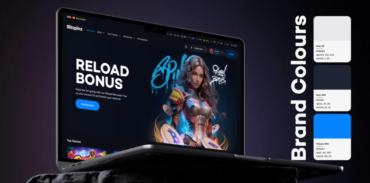
The Bitspinz brand palette has three named core colours: Grey-50 (#E8E8E9) for text, Grey-500 (#161927) for the base and Primary-500 (#0584FF), a saturated blue, for action. We measured them against the WCAG 2.2 contrast minimum (W3C, checked on 23 October 2026), which asks for 4.5:1 for normal text and 3:1 for large text:
| Pair | Contrast | Good for |
|---|---|---|
| Grey-50 text on Grey-500 | 14.26:1 | All text |
| Primary-500 on Grey-500 | 4.78:1 | Links, active icons, text of any size |
| White on Primary-500 | 3.65:1 | Large or bold labels only (from 24px, or about 19px bold) |
The last row is the kind of thing a mood board hides. A blue that looks perfect as a button colour needs either large, bold labels or a darker shade for small white text. Blue also stands apart from the market: next to purple, pink and gold lobbies it reads as calm and technical, which suits a crypto casino.
One accent for action
When everything glows, the player cannot tell what is clickable. One accent colour reserved for action solves this, and it is the clearest way a palette helps conversion without any tricks.
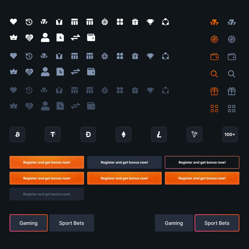
Woombet’s accent is orange. In the UI kit it is used for the main button, the active icon and the selected tab outline, and almost nothing else: icons have white, grey and dark grey states, the secondary button is dark, and the disabled one is faded. Because orange means “this is the next step”, the main action on a screen finds itself and the player does not have to look for it.
The brand has to work off the screen too
A casino brand does not live only in a dark lobby. It goes on banners, social posts, conference stands and merchandise, often on white.
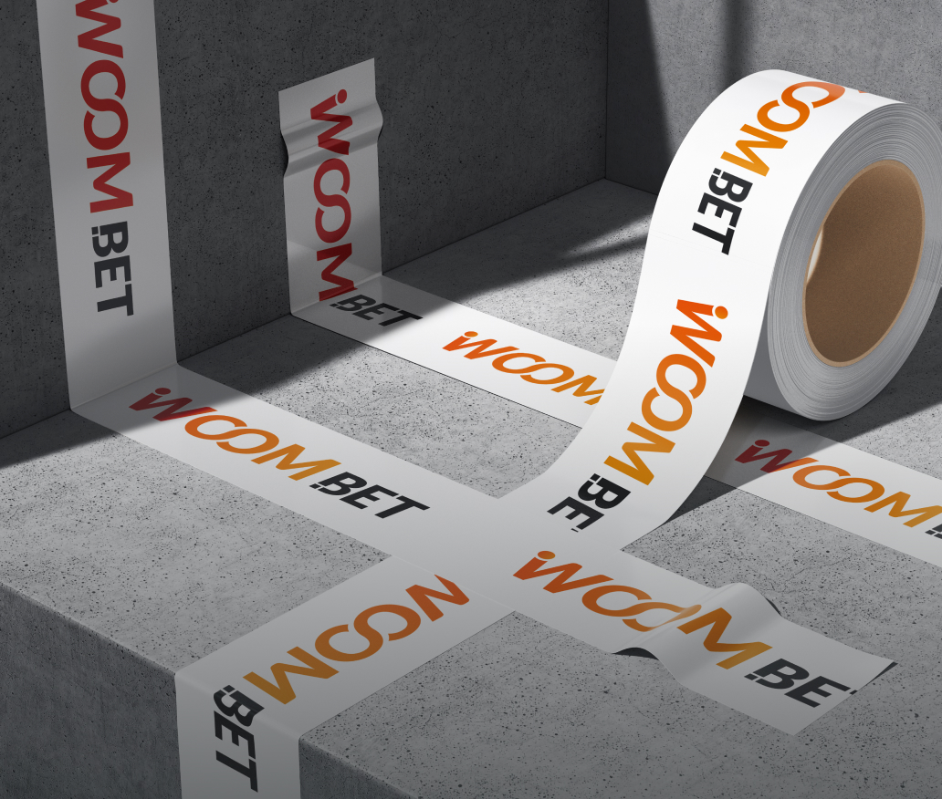
The Woombet logo pairs an orange-to-red gradient with black lettering, so it works on white tape as well as in the dark header. Before approving colours we always try the logo and the accent on white, on a photo and in one colour; a palette that only works on black is half a brand.
A checklist for your casino fonts and colours
- Is there one display face for the brand and one UI face for the interface?
- Does the UI face have clear, tabular digits and every alphabet your markets need?
- Are the font licences valid for web, apps and ads?
- Does every colour have one role: base, text, action or status?
- Is there exactly one action accent, and does it pass contrast on the dark base?
- Do the logo and accent work on white and in one colour?
- If you removed the gold and neon, would the brand still be recognisable?
Fonts and colours are part of every platform we design; our casino UX/UI design service covers the brand style, the UI kit and the screens together. How a strong theme and characters carry a brand into the lobby is covered in themed casino design, and what drives the budget in how much a casino website costs.
Frequently asked questions
What fonts and colours work for a casino brand?
Two typefaces with separate jobs: a characterful display face for headlines, banners and promos, and a plain, legible UI face with clear digits for menus, balances, forms and tables. For colour, a small palette with fixed roles: a dark base, a light text colour, one accent reserved for action, and green, amber and red for statuses. Neon and gold work as accents, not as the whole identity.
What is a good casino font?
For the interface, a font with clear, tabular digits, so 1 and 7 or 0 and O are never confused and columns of amounts stay aligned; at least regular, medium and bold weights; every alphabet your markets need; and a licence for web, apps and ads. For the brand, a display face that stays recognisable in a banner, an app icon and a small ad creative.
What colours are used in casino design?
Most online casinos use a near-black base with purple, pink, gold or neon accents. A dark base is useful because players spend long sessions in the lobby and game art stands out on it. The brand becomes recognisable through its accent: Bitspinz uses a saturated blue, Woombet orange, and Sirwin green with gold.
How do you build a casino colour palette?
Start from roles, not colours: one dark background and one or two surfaces, a main and a muted text colour, one action accent, and status colours for success, pending and error. Then check contrast on the dark base against WCAG 2.2: at least 4.5:1 for normal text and 3:1 for large text. Finally test the logo and accent on white and in one colour.
Should a casino use one font or two?
Usually two. One typeface rarely does both jobs: a display face with character becomes hard to read in tables and forms, and a neutral UI face makes promos look flat. Bitspinz, designed by iDesy, uses Campton as the primary brand typeface and Inter for the interface.
How much does casino branding and design cost?
At iDesy, designing a casino platform starts from $5,000 and takes from two weeks. The final price depends on the functionality and modules, and on whether the brand style, UI kit and marketing materials are part of the scope.